How does typography work in Responsive web design
 Typography is very important part of the user experience. On the most superficial level, it makes the page look stunning, or not. It breaks text apart into more useable segments, making it easier to read the text. Depending on size and placement, it is informational, informing users how to use the page, whether it is navigation or supplemental information and many other usability and navigational queues. Of course typography doesn’t stand by itself. It works in concert with other design elements, placement, background etc. also help. This post will focus on typography.
In a seminar called, “Typography in Responsive Web Design”, Richard Rutter posits that “good typography is responsible for greater engagement during reading.” I’m sure everyone has gone to a page where the type was crowded, perhaps the leding was too tight, or the main body text was too small. Sometimes the color combination makes it hard to read or in later web-design, the font chosen did not have a fall back for devices that did not support the font, resulting in fuzzy pages that can be a challenge to read. Users have to decide whether they want to slog through it, or seek their information elsewhere. I am probably like most users, I go elsewhere.
Font selection
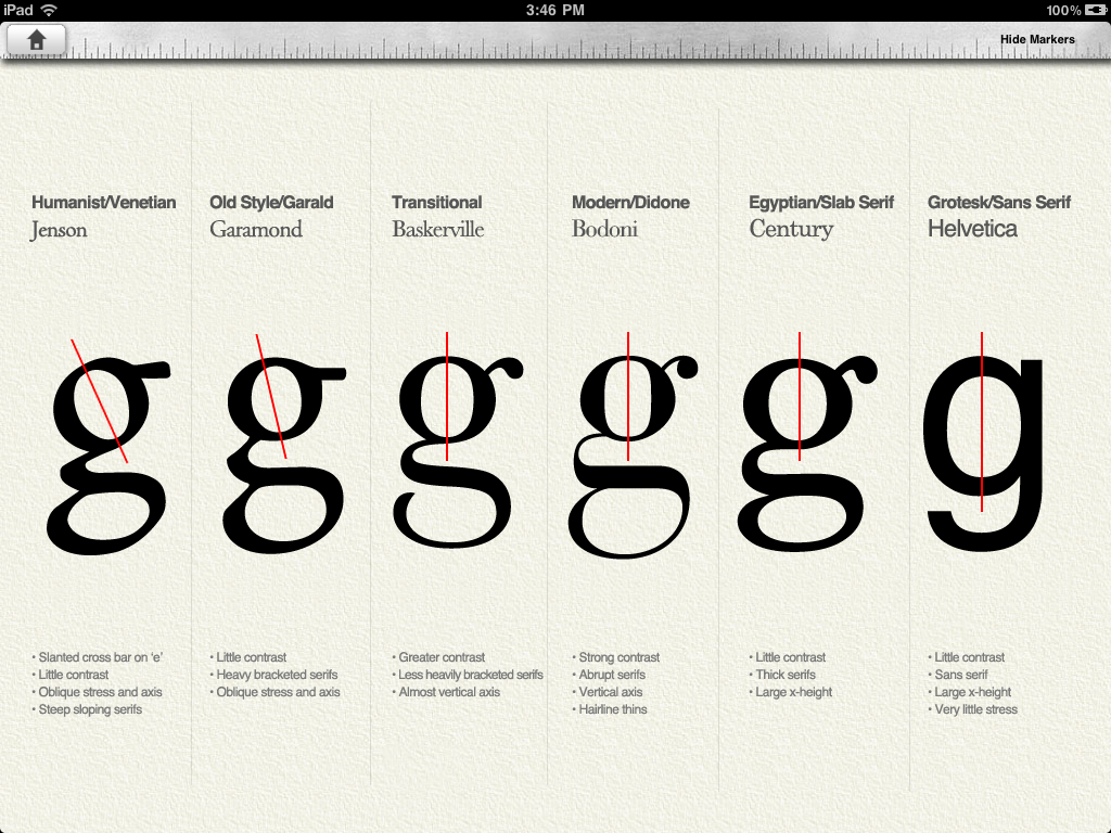
Good typography is inherent to a good user experience. So what is good typography? It is many things. It begins with choosing your pairing of fonts carefully. They must work harmoniously together and add cohesion to a page. If they aren’t quite right even in the smallest, most subtle of ways, they can add a feeling of clutter, even to a page that is somewhat bare and without graphics. When choosing font pairings, it is good to select a font with a super-family that contain both sans and serif versions, with different weights and variants, all created by the same designer. Selecting fonts from different families requires more scrutiny. If the type faces are too far apart in appearance, they can still theoretically work together harmoniously. If they are close, but not the same, they could clash. It’s not an exact science. Some of it is just instinct. One must think about the little things; the internal shapes of letters, how descenders and ascenders look together, the shape of the serifs (on type faces that have serifs), the weight, the width and the kerning of the letters and how they scale. Some type faces don’t have defined kerning pairs, and scale horribly at large sizes showing jagged edges or letter pairs with too much space between the letters. These are just some of the things one must look at in order to make decisions about font pairing.
Line length
Line length is also an extremely important component in readability and becomes more of a challenge when the width of the screen is variable. Ever read text on a very wide screen in a responsive layout that isn’t maximized for max-length? According to the Baymard institute, the optimal line length for body text is between 50-60 characters per line, including spaces. If a line of text is too long, the reader’s eyes will have to spend time refocusing on the text. The inclusion of CSS3 media queries in responsive design has made it easier for designers to set ideal length for each viewport.
Designing for different viewports
The fundamental thing to understand about designing for different viewports is not about the size of the screen, but “when does my design break?” These media queries are called break points and are applied at the viewport size where the design begins to fail. So for example, when a paragraph gets too long to read, you introduce a break point that shortens the paragraph to improve readability. The same applies with text size. On a large screen, a designer may want to exaggerate the differences between header and body text. On a smaller screen, this difference may not work well. The headings take up too much screen real estate, or the body text becomes too small to read easily. A more user friendly approach involves rethinking the proportions between the typographical elements, optimizing it for the viewport with the user experience in mind. It’s substantially more work to do it this way, but the pay off is a better result and a pleasant user experience.
rems, ems & pixels, oh my
Many early adopters are using rems instead of ems, with a fallback of pixels. Pixels are much easier to use, but has always been problematic in IE6, which didn’t allow scaling. Thankfully, IE6 has retired. People got around the IE6 problem by using ems. They worked very well but are very difficult to manage because they are all about inheritance and multiplication. It can become extremely complicated when you have nested elements such as a div inside a list, inside of your body. Text will continue to decrease within each nest, and the math can become extremely complicated. CSS3 introduced a new unit, the rem(root em). It works a lot like ems but relative to the root pixel size, so if your base element is 16 pixels, then two rems would be 32 pixels. Unfortunately, IE didn’t start to support rem until version 9. To get around this problem, web designers design their selectors with two sizes; pixel first, and remafter.
Print people hate it
Typography is one of the foundations of all design. Responsive web design requires you to think about compromises between visual design and technology from the very beginning of the project. It inherently involves thinking about compromises and trying to find solutions that don’t have too many downsides. This is precisely what turns off a lot of print designers, and users of other traditional print media because they are accustomed to having pixel-perfect control on the page. Web pages, especially those designed responsively is a flexible medium and so the mindset has to be flexible too. Just like there is a difference bewteen engineering car engines and websites, there is a difference between designing websites and print brochures. The difference is the engineering and functionality that is involved. Responsive Web Typography is all about treating type with the respect it deserves in a variety of contexts, over which you don’t have finite control.
One Response
Comments are closed.