Building a responsive website for an artist
Introduction
I seldom build websites start to finish without a team of experts who work on each component separately. On this particular occasion, I decided to build one on my own to help out an artist friend of mine who needed an update. What started out as a simple project became increasingly more complex. This post will walk you through the entire process.
Background
The artist had a design that was built in Flash. The art displayed was extremely small by modern standards, did a poor job of displaying his work and did not function on Apple devices. In order to keep it current and up to date, It required the artist be familiar with AppleScript and FTP. As a result, the site was stale and several years out of date.
Objective
Install and create an updated website incorporating modern best of breed functionality by customizing pre-made templates.
Discovery
After consulting with the artist about his vision and technical requirements, I decided WordPress would be a suitable system for the task because it is easy to use. WordPress is an excellent solution for websites that require sustainability, expansibility and long-term upgradability.
Building the first prototype
The original vision of the website was brochure-ware with very few functional requirements. As work began, the scope began to creep. The original requirements were:
- The site should be responsive
- Content management should require as little effort as possible, driven by taxonomy.
- The site should be able to post to social media in tandem with new posts in order to cross-promote content.
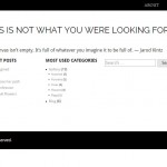
After an extensive search for a theme that incorporated these features, I settled on Photolab. It was an ideal theme for this purpose because it came prebuilt with social media, it handled assorted size and shaped images using the same aesthetic and visual treatment seen on Tumblr and Pinterest. This was very ‘in the moment’ and the artist favored that gallery style. The process of customization was minimal and involved removing the slide show from the home page. (The slide show required fixed sized images which did not work for this purpose.)
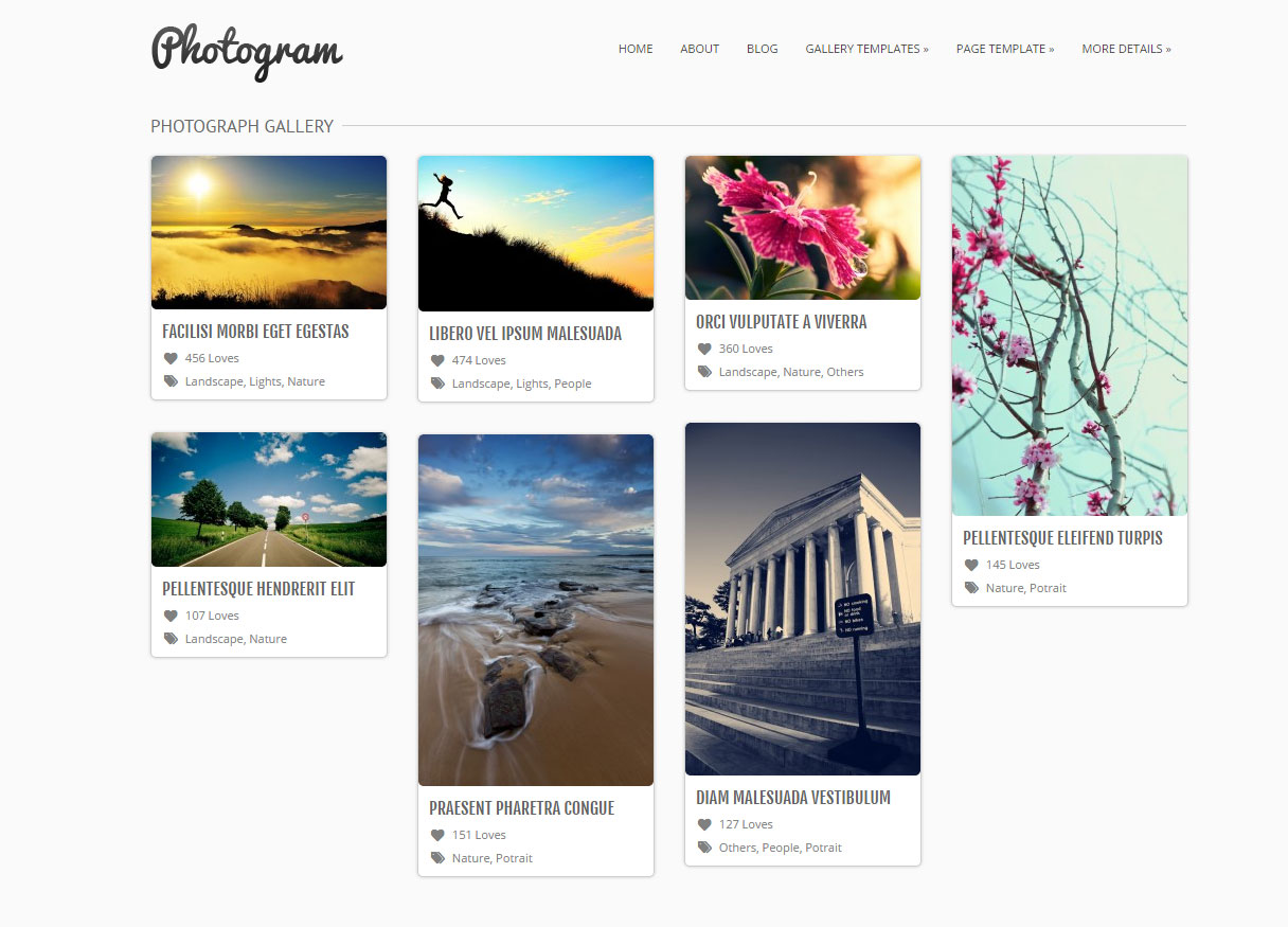
I presented the near final design to the artist. It was rejected because the design was too busy. He wanted something far more simple and cited Salon.com as an example for my base aesthetic.
Unfortunately, with a hard-drive failure, I did not keep a working copy of my work. You can see a demo here.
Prototype two: Look like Salon.com
I went back my browser and looked for a base theme that was reminiscent of Salon.com. I wasn’t sure how I was going to adapt a Salon look and feel on a site that largely emphasized images. Salon has very different types of content. I expressed concerns that this aesthetic would not translate well for an image-driven website. The artist was adamant that this is what he wanted. When I emailed him an early prototype, he agreed that this is what he envisioned, and where he wanted to go. I continued.
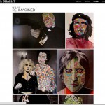
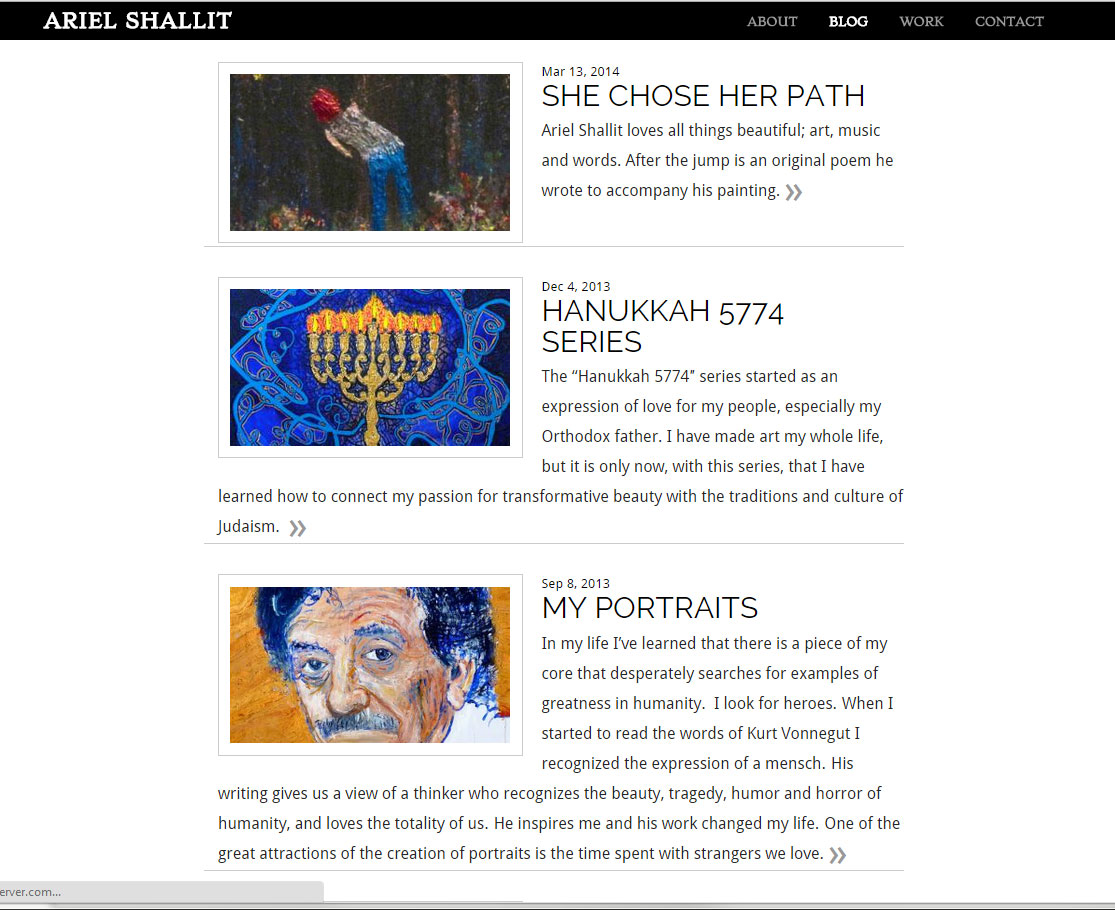
I believed the only way to make this text-heavy design work on a portfolio website is to incorporate text. This was an opportunity to expand beyond brochure-ware and build a real functional website that would gain traffic organically. The artist had begun blogging his thoughts on Tumblr. His former career incorporated almost all aspects of media including time spent as a composer, lyricist (aka poet), and a music and video creator and producer, both independent and for large advertising agencies. He also has a large collection of personal writings and poetry. I reasoned that there was plenty of content available and weaving it into his website would bring in more traffic which in turn make his work more visible. His multi-disciplinarian talent remains awe inspiring. Publishing his writings and other creative outputs seemed like a good way of bringing in traffic and opening up new commission opportunities for people who weren’t already familiar with his work.
I began work again; first by searching for an appropriate base theme that had a look and feel that could emulate the Salon simplicity. It had to be responsive, with different post formats pre-built. (Blog, Photo, Audio etc.) After several weeks of searching and testing different themes, I settled on a theme called Untitled. I knew this theme would be durable, stable, supported with quality code because it was written by the Auttomatic, the same team that built WordPress. It supported:
- Multiple posts formats (which is perfect for a painter, musician, video artist , writer.)
- Was fully responsive
- Had a Salon aesthetic
- Supported photo galleries
- Supported featured images
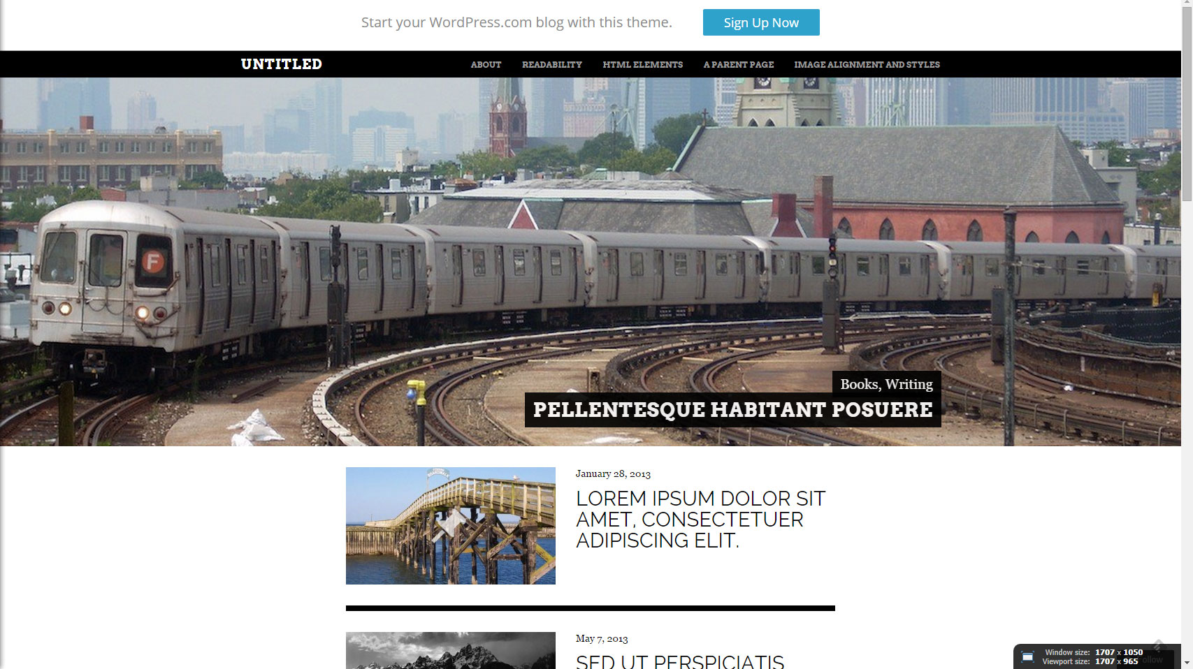
One of the impressive things about the parent theme was the incorporation of full-bleed images in the header with a thumbnail slider (not shown here). Unfortunately, for my purposes this was not useful. In order to remove them, I had to write new functions and css into the child theme. I don’t normally write custom PHP code so this took some time. I also changed a few elements on the page, made the thumbnails larger, incorporated finer lines between posts and dozens of other small details. The result is below.
Theme with the right look, but wrong functionality
Unfortunately, this theme did not support many of the functional requirements of the original specification. This meant I had to build out the functionality manually which became a much larger job than the original agreement. The artist and I discussed this and he agreed he would paint me a larger portrait in exchange for the work.
After I removed the full-bleed and custom slider, I had to build out a new photo gallery solution as well as accommodate the other functional requirements. I spent many weeks searching for, testing, configuring and scrapping different plugins to support:
- Simultaneous broadcast of new posts on WordPress, Facebook, Tumblr, Pinterest and Google+.
- Full gallery functionality that utilizes native WordPress shortcode for media. This spec was required because the artist strongly pressed that he needed content entry to be simple. In my research and testing, I was surprised how few plugins used WordPress native short code, how many were difficult to configure and how many were inflexible. I ended up using Carousel, a sub plugin of Auttomatic’s Jetpack which had a lot of other pre-built functionality.
Usability issues for content authors
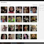
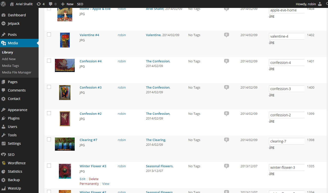
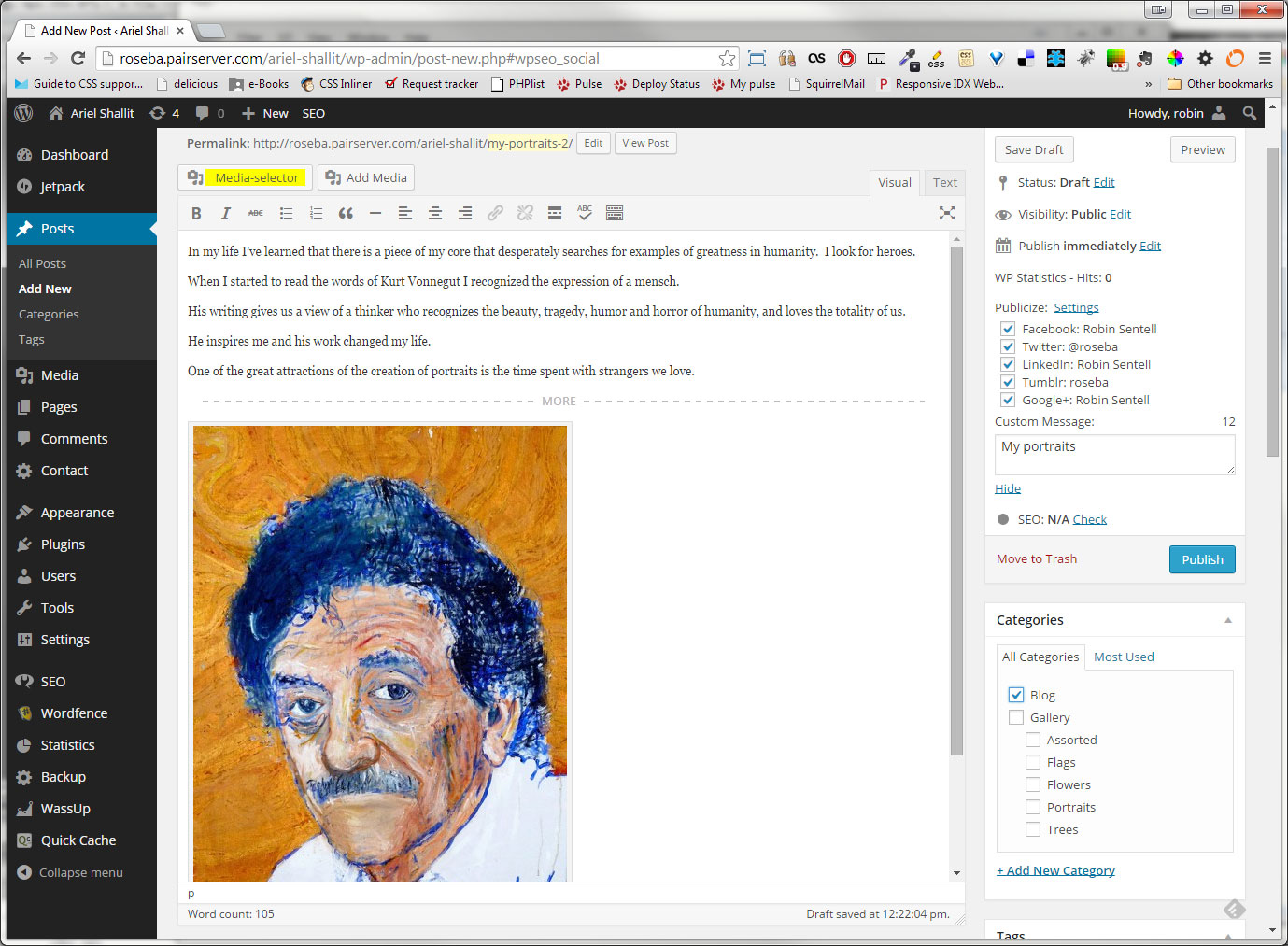
While fleshing out content, I discovered usability issues and problems that needed solving. How would someone who entered new content into a photo gallery identify the media-id’s? The previous version of WordPress did not incorporate thumbnails in the gallery creation view so it was important to identify the media id’s at a glance. What happens if one has to replace the images? One doesn’t want to upload a new one, delete the old one and do the title and captioning work a second time. How can one organize the media so it’s easy to find on the back end? I wanted to solve these issues, as well as others. I wanted to provide the artist a good user experience so that he would feel empowered to maintain his own site. I ended up installing:
- Enable Media Replace: This enabled images to simpy be replaced.
- Media File Manager: This enabled images to be put into categorized folders. (Essential if you have a lot of images to keep track of.)
- Media Rename: In order to maintain quality SEO, file naming was important. I didn’t want the artist to have to re-upload the images in order to rename the file.
- Reveal IDs: This showed the ID number of the media in the dashboard so that when the artist added another image to a gallery, he would have the media id readily available
- WordPress Media Tags: This enabled the media to be tagged with hashtags for SEO purposes (not shown in the image below).
Performance issues
While I was very pleased with the Carousel plugin, I experienced performance issues with images. I had to experiment with different files sizes and save formats so I was able to deliver high-quality images for large screens without choking mobile screens on slower connections. After a few days of trial and error, I perfected a specification that greatly improved speed:
- Photos would be no larger or wider than 1000 pixels.
- Photos would be saved in Photoshop using save for web as a jpg with the progressive check boxed marked.
- Finally, I would try to keep each files under 100K.
This greatly improved performance, but not enough. There were a few problems with the Carousel’s display on an iPhone4. I worked closely with the plugin authors to resolve it. In turn, they informed me about a useful sister module called Photon. Photon took all images, created smaller copies of them, and delivered the device appropriate sized image to the user through what is called a CDN, (Content Delivery Network). This was a fantastic discovery and greatly improved performance.
Continued performance tweaking by upgrading the servers
While I was working out optimal file optimization protocol and Photon, I decided to upgrade the servers. I had been experiencing random errors, especially when loading new plugins. The catalyst for change was the inability to set simple permissions for files on the server which is a huge security issue. I knew the problem was a result of the server being on Windows. I called the web host and worked closely with them first to upgrade from WIndows to Linux, and then followed up with a second migration that moved it to a virtualized server. Each move created some rendering problems, which I was able to solve quickly. The end result was a site speed improvement by more than double. The artist noticed the speed increase right away.
Configure Social networks
Jetpack also came with another plugin called Publicize. It incorporated check boxes next to the Publish button allowing the author to publish new content to his social networks with one click of a button. This was one of the only plugins that was easy to configure, did not require a custom API, and incorporated multiple social networks. It was very easy to use.
Navigation and architecture
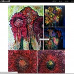
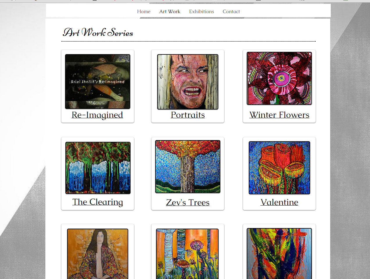
The artist was adamant that the content should be as easy to publish as possible. He wanted to post an image and have it automatically add itself to a gallery by use of keywords. This was a very difficult problem to solve. While I wasn’t able to tag each piece of media and have it assign itself to a gallery, I was able to build categories of galleries by keyword, separating different types of art using keywords and a dropdown menu. This eliminated a traditional landing page with thumbnails and made the process two steps rather than three.
For example, if you wanted to see the entire body of the artist work, you would click on his main art page, and see everything, with the most recent work near the top. However, if you wanted to see more specific work, you could select a sub-menu for flowers as shown in the link. This solution eliminated an extra landing page, extra content maintenance tasks, and made the artwork more accessible. (Had the artist had different requirements, I would have opted to create a traditional landing page with thumbnails in addition to this solution.)
Sticky menus and responsive design
During the entire process, I kept the artist informed of my work through frequent emails with links and questions to be answered. He was very pleased with the work and asked if the navigation could be sticky. What he meant was that he wanted the navigation at the top to follow the user when they scrolled down. After doing some research, I was able to add this functionality. However, the extra css broke some of the existing css margins associated with the responsive design. It took a few weeks of constant tweaking to get the margins good enough for many different screen devices. With Responsive design, the best one can always hope for is good enough. While the parent site was already built responsively, there were many cracks in the parent theme. I had already done a lot of tweaking to the home page to remove the slider and customize the site. I spent another few weeks correcting typography and margins and tweaking how the images reduced and expanded at different screen ports
Ready to launch
Before launching, I incorporated other features.
- WordPress security to protect the site from hackers
- Database backups
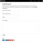
- A contact form
- A Facebook like button so that the artist can be found on his fan page on Facebook
- Social shares so users could share his art on their favorite social network including Pinterest
- Caching to improve performance even more
- Several analytics plugins to analyze site traffic and popularity
- WordPress SEO to enable the content to be customized and discovered by and for search engines
- A custom Favicon I designed in Photoshop
- Custom 404 page with a search form incorporated
- A streamlined url structure so that the links were as short and concise as possible.
There were many other tweaks that I added to this site that I have not listed here.
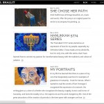
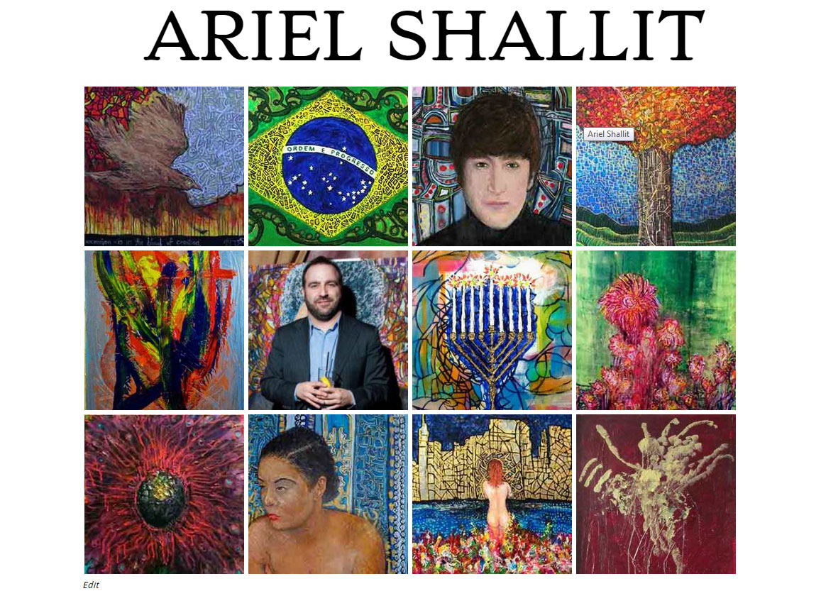
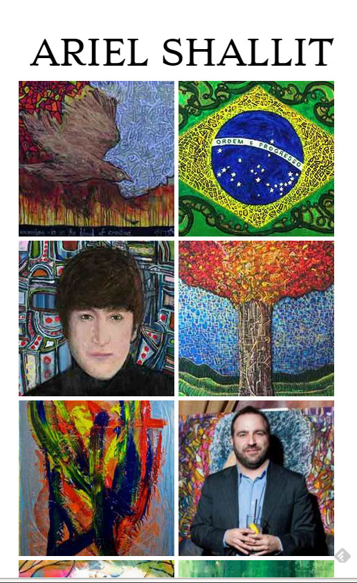
Splash page
The artist expressed that he did not like the home page which consisted of a blog style page with thumbnails. He wanted it to have more impact. This posed another problem to be solved. How does one create a splash page of images on a responsive website where images are not responsive elements? After several trials and errors with different ideas and designs, I came up with an idea to display a grid of thumbnails that would change size and the number of items displayed on a grid adapting to the viewport size. The images could be swapped in an out as needed as a way to keep the design fresh, and up to date with fresh content. The first shot is on a desktop, while the second is a rendering on a mobile device like a Samsung Galaxy 4.
Site Launch
The site was launched and the artist said he was very pleased with the work. We discussed making some minor changes to the typography. We were never able to schedule a mutually convenient time to hash it out and get the work done but we both considered this change it a minor cosmetic issue. We did not give it priority.
A few months after launch, the artist asked if I could incorporate e-commerce onto the site. I said it could be done, but I didn’t want to be the person to do the work and, it was way out of scope. There are many e-commerce plugins available in WordPress. Most require a payment even to try them out. Since I have never built an e-commerce site, I was not comfortable with the liability involved with credit card transactions. I felt his needs would be better fulfilled by someone who was already familiar with e-commerce plugins. The artist expressed that this was a low priority request for the distant future so I needn’t be concerned about it.
The site was live for approximately nine months when the artist replaced it with a new site. He explained that he changed his mind about the aesthetic and wanted a platform that incorporated e-commerce easily. It was a little disappointed given the amount of work I did on the site. I built it to last many redesigns which is why I dedicated so much time to getting the administrative details right. The theme could have easily been changed, and if coerced, I probably would have capitulated on the e-commerce portion of it.
Below is his new website built with a Wix builder.
Extras
The following photo gallery incorporates many of the screen shots from this post and a few additional shots that demonstrate the depth of the work. Thank you for reading.
Gallery of complete screens